Saturday, March 25, 2017

Graphic Patterns and Experiments (Week of 3/19/2017)


I'm back today with another weekly roundup of the art journal pages I ended up finishing up. I've been working in this same journal for six or seven weeks, and almost all of its 80 pages have been worked on to some extent. I've been working on going back to previous pages and finishing things up, covering things I don't like, etc. This is the result of some of that.


 I struggled with this page ever since I started it. I had used some Mod Podge to adhere pieces of paper towel to the surface to create a texture, but it was incredibly hard to work on top of.

This week, I finally finished it off. It's officially one of my favorite pages of the entire journal, if for nothing more than the fact that it's completely different from any of the other pages. I love what can happen when you push yourself outside of your comfort zone, and that's exactly what I did with this page.


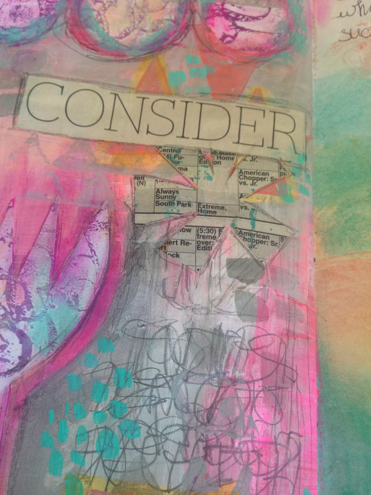
This is another one of the pages I went back to; even though it already had a title on it, I didn't like the way it had turned out, so I ended up covering almost all of it with white paint. I decided to go simple, and some of the background layers show through (you can see this a bit better in the close ups).


Ultimately, I do like the way this page turned out. As you can see in the above deal shots, there was a title underneath the layer of pink paint that I applied to the page, and some leftover journaling I had done. There's a possibility I will go back in with some more words, but for now I'm pretty okay with it.


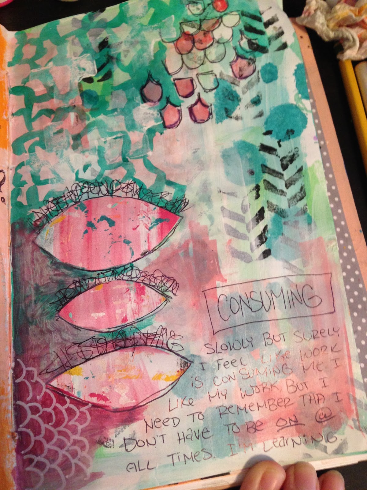
I really like the simplicity I was able to achieve with this page, even with all of the layers. Maybe it's funny that I call this simple, but typically I need a lot more layers than this to be happy with a page. Essentially, this was a cleanup page. I took leftover bits of paint and tape, collage and stenciling, and continued to build up this page slowly but surely. The result is bright and I like the general aesthetic of it.


In the detail shots of this page, you can see the details that I ended up putting in. This was probably one of the pages I put the least thought into - I was just cleaning off my tools and trying to create something that I liked in the process.

Maybe I need to do this a bit more.


 This is the only really side-by-side spread I finished this week, since I don't typically work over two pages, and I jump around quite a bit. However, I do like the way both of these pages turned out, even if the page on the left is way brighter than the one on the right.


 On the left, you can see some of my experiments with spray ink. I have some Dylusions spray ink that I hardly ever use, since it's reaction with water is something I haven't quite gotten the hang of yet. In this page, I tried something I had seen in a YouTube video, spraying the ink directly into wet Mod Podge; it was significantly less prone to spreading, which was an interesting discovery.

On the right, I was playing with using gray in my pages. I've always loved the color gray (most of my clothes are actually either gray or black) and the way it contrasts with brighter colors. I wanted to try that out on this page.


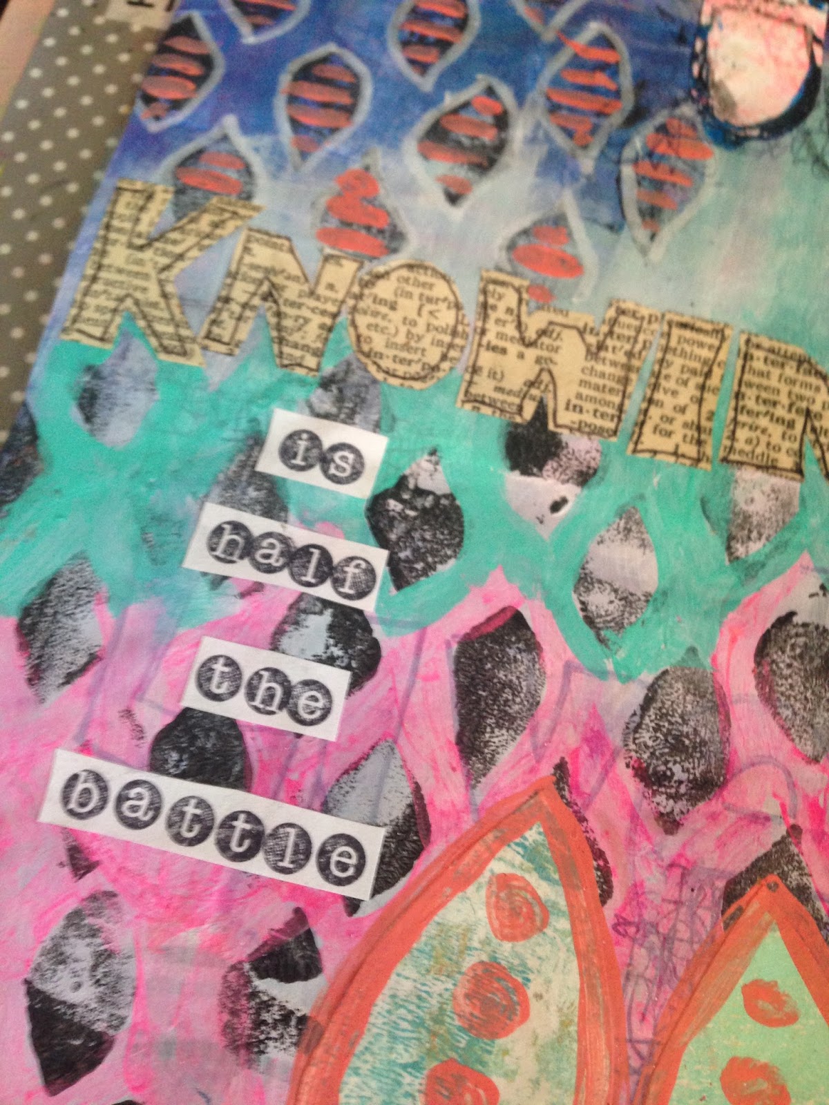
In the final page I have to share with you guys today, I was playing with graphic and large shapes and focal points. I find that the process of stamping and collaging and doodling is extremely soothing to me, and serves as a good way to get all of my emotions out.


In this page specifically, I was working with the idea of "doodling" with a paintbrush and paint instead of markers or pastels, which is what I typically tend towards. I like the relaxed effects that the brush gives me, specifically in my art journals.


As for the Season of Art 101 over at Get Messy Art Journal, these are my six favorite pages. I feel like they are all very cohesive as a set of photographs and it makes me feel as though my style is starting to fall into place.

Thank you all for checking out my pages, and I hope you enjoyed looking them over!

Sunday, March 19, 2017

Emotion & Journaling (Week of 3/12/2017)


Hey guys, I'm back with another week's worth of pages, and this time around I get a little more deep and emotional with them.

 Art has always been my way of letting out my emotion and feelings, but this week especially that sensation has been multiplied by a hundred. I'm at the end of an art block I was experiencing (and still pushing myself through) and that left me with a lot of overwhelming feelings to get out of my system.


Almost all of my pages this week took a ton of layers to actually bring to completion (I think because I already overworked them a bit), but I managed to get things pulled together in a way that was manageable.


This is one of my favorite pages, though it is potentially the most chaotic. I had already dumped a bunch of layers onto this page when I started to work with the face. I used white paint mixed on a piece of plastic with water based markers; I wanted to see if I could make my own paint colors. As it turned out, it worked beautifully.


The actual face itself was a representation of how I was already feeling when I started to draw, and there is a substantial amount of journaling on this page, both legible and not. It was a lot of fun to just let go of the fear of creating and just put layer on top of layer.

I think that the finished page is fairly busy, but that's what I love about it. It's a rather accurate representation of how I was feeling.


This page was actually an attempt at being a bit more conscious with my journaling. I tend to overthink most things in my life, so forcing myself to just sit and think tends to be a fairly dangerous thing to do. I use the phrase "stuck in my own head" to describe this sensation.


However, this was a nice way of forcing myself past that; I allowed my mind to wander, my thoughts to reveal themselves, and then I dumped them on the page. It was a relief, and something I'd love to experiment with more in the future.


I apologize for the darkness of this full shot, but you can see the true colors better in the detail shots. I'm not quite sure if I'm finished with this page yet (considering some neon pink oil pastel), but I thought I'd share it regardless.


 I put the finishing touches of this page on this morning, and I find it amazing just how meditative all the doodling and paint layers can be. I'm starting to find my groove, and that's a nice feeling.

I also find that bright colors and abstract shapes make me happy.


The final page I have to share with you guys today is actually the first that I finished this week (but the furthest into my journal). This was the page that I think really pushed me out of the block I was feeling last week. I got caught up in this page and pretty much completed it from start to finish in one two or three hour evening sitting.


It's not my favorite face I've ever done, but I love the effects I was able to get with colored pencils, and how relaxing and soothing it was to work on.

I hope you all enjoyed seeing my pages from this week, and I'll see you all next week!

Saturday, March 11, 2017

Incorporating Drawings (Week of 3/5/2017)


For some reason, this week was rough as far as art went. I didn't do a whole lot of illustration, and I worked on a ton of pages in my art journal and didn't finish very many. I'm blaming it on spring break.

However, despite that being the case, I do have a couple of pages to share with you guys this week, and I hope you like them regardless.


The first page I have to share is probably one of my favorites. I wanted to do something very loose as far as a face was concerned, and I love the way this one turned out. I think incorporating neon pink into her face took some of the edge of perfection off.

She has an extra long neck and is sort of floating in space, but I like the effect that ultimately gives. I also got a bit of texture into her hair with black acrylic paint and rubbing a colored pencil over the top, though I'm not sure if I could recreate that if I tried. Maybe I'll have to give it a shot sometime.


It's only the second page in and I think you can probably see my experimentation with bright neon colors this week. I was working towards this a little bit last week; it's been bout a month since I've started art journaling again, and slowly but surely I think my style is starting to return to me.

I like bright colors and bold patterns and getting my thoughts out. Doodling inside of collaged shapes is something I've really been enjoying lately.


I actually polished off this page last night, though I'm not convinced that I'll never go back and add to it. Part of me wants to add some dark black outlines around the "flower" at the bottom of the page. But for now, I'm leaving it as is.


Underneath all of the layers of paint, there's a terrible drawing of a bottle of paint that was on my desk. I made it purposely bad, in pencil, and you can see some of the remnants of it peeking through the paint and collage and journaling. I was just trying to get some of my stress out, and this was my way of doing that. It sort of inspired the words I wrote going up the side.

It's not even that I don't consider abstract paintings or drawings art (I do!) but sometimes I get overwhelmed by the idea of everything needing to be perfect. It's an art journal and I was trying to get that feeling out of my system.


This final page is pretty busy, and has the potential to be added onto later as well. Preferably by adding some white paint and toning the whole thing down. However, this was also an attempt at getting myself to relax with my drawings, so I pretty much scribbled this figure in pen down onto the page. It was a nice change of pace to the structured "sketch first" approach I usually take.


The blue around the figure is actually a regular Crayola marker that I applied to the page on top of the paint. Because the paint was down, I was able to apply a wet brush to the marker and spread it into a vibrant watercolor look. I'm happy with that effect, if nothing else.

If you get anything out of this post, I hope you get that sometimes we just need to push through our art slumps. I feel like, for me, this especially applies to art journaling. I'm able to write out all of those "slump" emotions on the page and playing with paint typically tends to improve my mood.

I hope you all enjoyed looking at this week's art!

Sunday, March 5, 2017

Faces and Bright Colors (Week of 2/26/2017)


 I have quite a few pages that I ended up putting the finishing touches on this week (there are even a few that didn't make it to this post), and I'm super excited to share these ones. i feel as though I'm starting to fall into a little bit of a style after adjusting to familiarizing myself with art journaling once again.

With this first page, this was a page I had been wrestling with pretty much since I started the journal. Nothing wanted to work with me, so I eventually ended up painting over most of it in white and blending some purple into it. The blue on the left hand side of the page were some spray inks that bled up through, and the circles from a scrap of paper put the finishing touches on.


This is one of my favorite spreads in the entire journal.

Even though it isn't technically a two page spread, I like the way the two pages look sitting next to each other. I like the consistent theme of the color purple (one of my favorite colors for artwork) and the graphic doodling/collage elements that I incorporated.

The face on the right hand page is actually a face I had drawn with alcohol markers in one of my sketchbooks, and I scanned it to use as a collage element (the body is mostly painted in on this page).


This is another one of the more interesting spreads in my journal, in my opinion, and I absolutely adore the bright colors.

I've been experimenting a bit with using journaling as a design element, as well as contrasting black with super bright and exciting colors. I've also been playing with cutting out graphic, blocky shapes and collaging them in. It's a lot of fun and a good way to get myself to just relax.


 Here are a couple of close-ups of the details of this spread.

On the left, you can see that I put in a lot of detail and doodling with a ballpoint pen, which was a lot of fun. Ballpoint pens write over top of acrylic paint beautifully, in adition to being cheap. I don't feel precious about the supplies I'm using, which is a nice bonus.

On the right, you can see a close up of a couple of little houses I cut and pasted from another photocopy of my work. I had done a "collage sheet" a while back with purple watercolor and doodled on top of it with a Sharpie. I love using bits of the photocopies in my artwork.


For this face, I only had one idea in mind; I wanted to try to use primarily black and white for the shading.

I used a Portfolio water-soluble oil pastel in black to outline my shapes, then I diluted it to create the shadows. I also added a little bit of the neon pink oil past to this girl's cheeks to give her a bit of character. I'm super exciting to photocopy this one, I think it will be fun to incorporate into other pages.


This is one of those pages that I'm a little on the fence about. I absolutely love the doodling on it, but I almost feel like it's a little too busy. However, I've officially called it on this one, and I'm not planning on adding anything else to it. That doesn't mean that I never will, but for now, I'm satisfied with it.


The doodling around the title was super relaxing to do, and I never felt like it needed to be particularly perfect, which was really nice. I'm also liking the color palette of pink, yellow and blue contrasting with the almost harsh black. 

I need to stamp with bubble wrap more often, because the visual texture I achieved with it was great. 


For the final page I have to share with you guys today, we have a sort of doodled, bright colored, confusing page. I had some ideas that I wanted to experiment with (using gouache, testing a pattern for a stamp I wanted to make, cut out shapes) and I knew that I wanted to use bright colors, since I think that's really been helping with my mood lately. 


The result isn't super cohesive, but I think I like it regardless.

I've been having a lot of fun playing with cutting out shapes from scraps of paper I've cleaned my brushes on. The results are always sporadic and interesting, giving me something that I never could have planned if I tried.

I hope you guys enjoyed looking at these pages, and I'll see you next week!