Showing posts with label acrylic paint. Show all posts

Sunday, April 9, 2017

Season of Contrast + A New Journal (Week of 4/2/2017)


A new season started over at Get Messy Art Journal and this time it's all about contrast!

People that are familiar with me and my artwork (specifically my illustration work) will know that I'm a big fan of contrast. I like dark things with beautiful things, light with dark, and seeing how these contrasting elements work together to create something that is ultimately more meaningful in the end. Thus, this season was perfect for me!

I'm most happy with the page on the left hand side, which is actually the endpaper for this journal (which I also made).


Here's a close up of some of the details. I knew that I ultimately wanted to create something that was more thought out and "planned", though I still went with the flow as far as what I did next. It was a lot of fun to create something in this manner, and I think I will try something like this again in the future.

Unfortunately, I've been extremely busy lately, so these two pages are all I have for you at this time. I do hope you liked them as much as I did though, and I'll see you all next time.

Saturday, March 25, 2017

Graphic Patterns and Experiments (Week of 3/19/2017)


I'm back today with another weekly roundup of the art journal pages I ended up finishing up. I've been working in this same journal for six or seven weeks, and almost all of its 80 pages have been worked on to some extent. I've been working on going back to previous pages and finishing things up, covering things I don't like, etc. This is the result of some of that.


 I struggled with this page ever since I started it. I had used some Mod Podge to adhere pieces of paper towel to the surface to create a texture, but it was incredibly hard to work on top of.

This week, I finally finished it off. It's officially one of my favorite pages of the entire journal, if for nothing more than the fact that it's completely different from any of the other pages. I love what can happen when you push yourself outside of your comfort zone, and that's exactly what I did with this page.


This is another one of the pages I went back to; even though it already had a title on it, I didn't like the way it had turned out, so I ended up covering almost all of it with white paint. I decided to go simple, and some of the background layers show through (you can see this a bit better in the close ups).


Ultimately, I do like the way this page turned out. As you can see in the above deal shots, there was a title underneath the layer of pink paint that I applied to the page, and some leftover journaling I had done. There's a possibility I will go back in with some more words, but for now I'm pretty okay with it.


I really like the simplicity I was able to achieve with this page, even with all of the layers. Maybe it's funny that I call this simple, but typically I need a lot more layers than this to be happy with a page. Essentially, this was a cleanup page. I took leftover bits of paint and tape, collage and stenciling, and continued to build up this page slowly but surely. The result is bright and I like the general aesthetic of it.


In the detail shots of this page, you can see the details that I ended up putting in. This was probably one of the pages I put the least thought into - I was just cleaning off my tools and trying to create something that I liked in the process.

Maybe I need to do this a bit more.


 This is the only really side-by-side spread I finished this week, since I don't typically work over two pages, and I jump around quite a bit. However, I do like the way both of these pages turned out, even if the page on the left is way brighter than the one on the right.


 On the left, you can see some of my experiments with spray ink. I have some Dylusions spray ink that I hardly ever use, since it's reaction with water is something I haven't quite gotten the hang of yet. In this page, I tried something I had seen in a YouTube video, spraying the ink directly into wet Mod Podge; it was significantly less prone to spreading, which was an interesting discovery.

On the right, I was playing with using gray in my pages. I've always loved the color gray (most of my clothes are actually either gray or black) and the way it contrasts with brighter colors. I wanted to try that out on this page.


In the final page I have to share with you guys today, I was playing with graphic and large shapes and focal points. I find that the process of stamping and collaging and doodling is extremely soothing to me, and serves as a good way to get all of my emotions out.


In this page specifically, I was working with the idea of "doodling" with a paintbrush and paint instead of markers or pastels, which is what I typically tend towards. I like the relaxed effects that the brush gives me, specifically in my art journals.


As for the Season of Art 101 over at Get Messy Art Journal, these are my six favorite pages. I feel like they are all very cohesive as a set of photographs and it makes me feel as though my style is starting to fall into place.

Thank you all for checking out my pages, and I hope you enjoyed looking them over!

Sunday, March 5, 2017

Faces and Bright Colors (Week of 2/26/2017)


 I have quite a few pages that I ended up putting the finishing touches on this week (there are even a few that didn't make it to this post), and I'm super excited to share these ones. i feel as though I'm starting to fall into a little bit of a style after adjusting to familiarizing myself with art journaling once again.

With this first page, this was a page I had been wrestling with pretty much since I started the journal. Nothing wanted to work with me, so I eventually ended up painting over most of it in white and blending some purple into it. The blue on the left hand side of the page were some spray inks that bled up through, and the circles from a scrap of paper put the finishing touches on.


This is one of my favorite spreads in the entire journal.

Even though it isn't technically a two page spread, I like the way the two pages look sitting next to each other. I like the consistent theme of the color purple (one of my favorite colors for artwork) and the graphic doodling/collage elements that I incorporated.

The face on the right hand page is actually a face I had drawn with alcohol markers in one of my sketchbooks, and I scanned it to use as a collage element (the body is mostly painted in on this page).


This is another one of the more interesting spreads in my journal, in my opinion, and I absolutely adore the bright colors.

I've been experimenting a bit with using journaling as a design element, as well as contrasting black with super bright and exciting colors. I've also been playing with cutting out graphic, blocky shapes and collaging them in. It's a lot of fun and a good way to get myself to just relax.


 Here are a couple of close-ups of the details of this spread.

On the left, you can see that I put in a lot of detail and doodling with a ballpoint pen, which was a lot of fun. Ballpoint pens write over top of acrylic paint beautifully, in adition to being cheap. I don't feel precious about the supplies I'm using, which is a nice bonus.

On the right, you can see a close up of a couple of little houses I cut and pasted from another photocopy of my work. I had done a "collage sheet" a while back with purple watercolor and doodled on top of it with a Sharpie. I love using bits of the photocopies in my artwork.


For this face, I only had one idea in mind; I wanted to try to use primarily black and white for the shading.

I used a Portfolio water-soluble oil pastel in black to outline my shapes, then I diluted it to create the shadows. I also added a little bit of the neon pink oil past to this girl's cheeks to give her a bit of character. I'm super exciting to photocopy this one, I think it will be fun to incorporate into other pages.


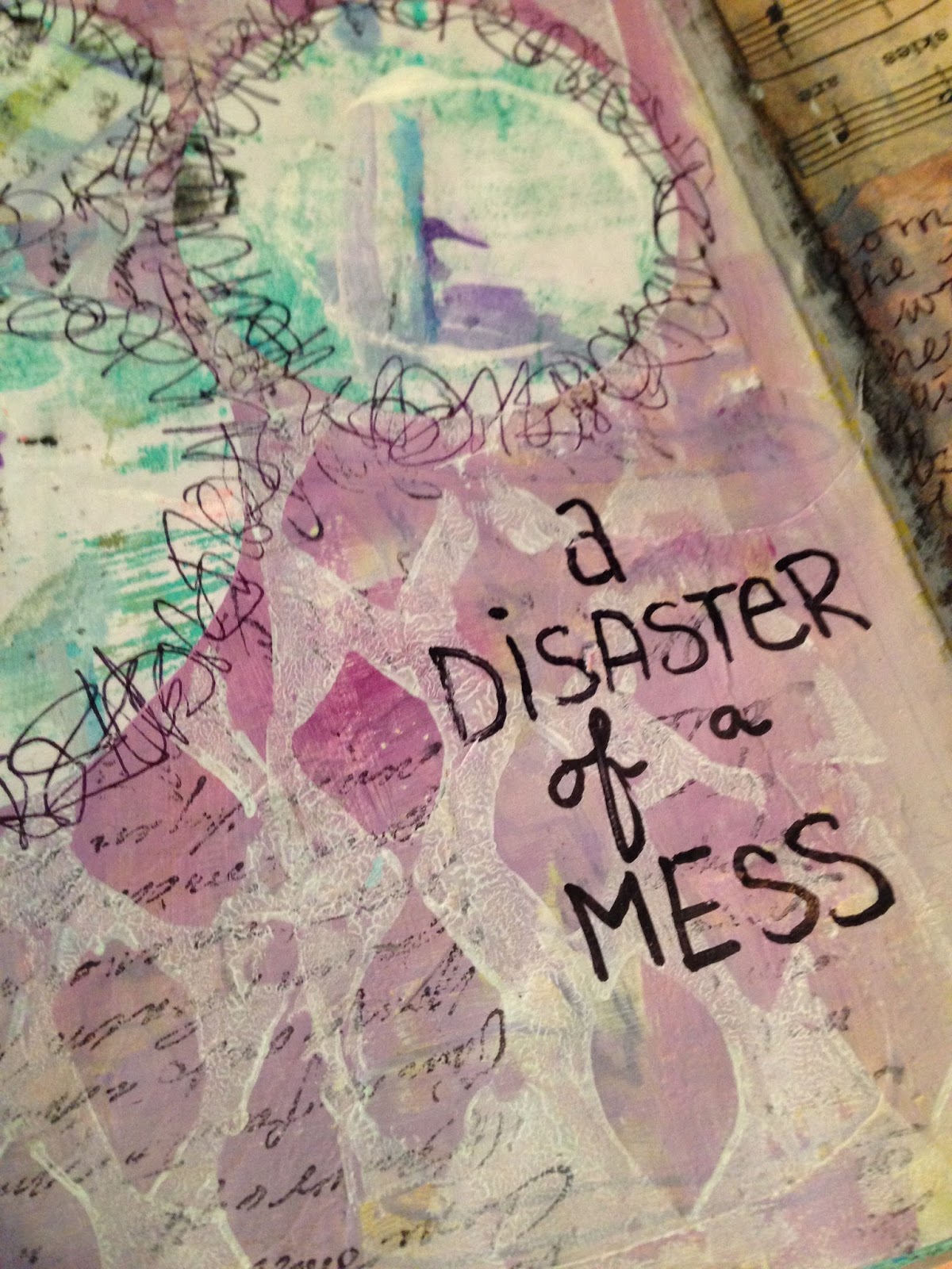
This is one of those pages that I'm a little on the fence about. I absolutely love the doodling on it, but I almost feel like it's a little too busy. However, I've officially called it on this one, and I'm not planning on adding anything else to it. That doesn't mean that I never will, but for now, I'm satisfied with it.


The doodling around the title was super relaxing to do, and I never felt like it needed to be particularly perfect, which was really nice. I'm also liking the color palette of pink, yellow and blue contrasting with the almost harsh black. 

I need to stamp with bubble wrap more often, because the visual texture I achieved with it was great. 


For the final page I have to share with you guys today, we have a sort of doodled, bright colored, confusing page. I had some ideas that I wanted to experiment with (using gouache, testing a pattern for a stamp I wanted to make, cut out shapes) and I knew that I wanted to use bright colors, since I think that's really been helping with my mood lately. 


The result isn't super cohesive, but I think I like it regardless.

I've been having a lot of fun playing with cutting out shapes from scraps of paper I've cleaned my brushes on. The results are always sporadic and interesting, giving me something that I never could have planned if I tried.

I hope you guys enjoyed looking at these pages, and I'll see you next week!

Saturday, February 25, 2017

A Smattering of Pages (Week of 2/19/2017)


Last week, I posted on Sunday, today I'm posting on Saturday. I'm not sure where the routine is going to fall, but I finished a ton of pages this week (even more than I'm going to show in this post), so I figured I'd write this post up before it got out of hand.

The first bit I have to share with you is actually only a piece of a page. I was wrestling with this page for weeks, adding here and there, doodling and painting over and doodling again. I finally think that I've gotten it to a place where I'm happy to at least leave it alone, and this little bit of journaling and the title feel extremely accurate right about now.


The next page is a lot brighter than the last one, and I used a shimmery blue paint that I've been hoarding practically since I got it. In the end, I'm glad that I did because I think it adds an extra element of interest to the page.


With the title and journaling of this page, my secret (or not so secret) emo self is making an appearance. This is also a continuation of the page with tissue paper laid down from this post.


Now here's something a little new, at least for this journal; faces. I didn't know if I wanted to create more mixed media faces in this journal or not, despite the fact that I've done it a lot in the past. However, this just sort of happened, and I'm more than glad that it did. I love the way the two pages of this spread sort of contrast but blend into each other at the same time.


In the first photo, you can see some of the details of the left hand page. I don't use colored pencils in my art journals a lot, but I wanted to see what Crayola pencils were like to work with on top of acrylic paint. As it turns out, the result is a lot of fun. With this face, I also had a lot of fun just trying to relax about proportions of the face - it's off and I know it. I'm okay with that.

In the second photo, there is a close up of the right hand page. I've been wrestling with this page for a long while as well, and I love the place I finally managed to get it to. I didn't mean to make a point when I started creating this page, but it seemed to have happened regardless. This also inspired (ever so vaguely) a watercolor piece, and I feel like this page might evolve into yet another finished piece. We'll see.


Now, this may be my favorite (or one of my favorite) pages in this journal thus far. I like the graphic nature of it, I think it's bold, and I like the face that I drew (I used a ballpoint pen). I also love the meaning behind this page.


All of that texture in the background? That was my handwriting. I was having a really tough time when I created this page, and I felt like all of my nerves were ON. I just wrote and wrote and wrote, all about how I was feeling, and by the time I had finished writing, I felt a whole lot better. These are the times that I regret the break I took from art journaling - it really is a form of stress relief for me.


The final page I'm going to leave you all with today is yet another one of my favorites. I knew that I wanted to do some wonky little houses, and I've set some goals for myself as far as using up the supplies I have before buying more. As a result, I decided to cut out bits of paper to collage down to create the shapes of the houses and the moon.


This is done in a super quirky style, and was in no way meant to be realistic. The doodling was done with Sharpie, so fine detail went out the window. It was nice to not have to worry about it, and I love the way the page turned out in the end!

I hope you all enjoyed seeing what I've been up to this week, and I'll see you next time!

Sunday, February 19, 2017

Textures and WIPs (Week of 2/13/2017)

For several reasons that have come to my attention recently, I thought it would be nice to start a blog in order to share some of my mixed media projects!

I'm Jordan, I'm 20 years old, and I've recently been extremely interested in illustration. You can see my work on my Instagram here. However, in an attempt to relax in the realm of my artwork, I've recently taken up art journaling once more. Years ago I was extremely involved in the community (I think it was 2011? Or thereabouts) but only recently have I become involved once more. I joined Get Messy, and this is the Art 101 season, which I've been having a lot of fun with. I'm here to share my texture pages from this week.


First and foremost, this is a rather simplistic page in comparison to a lot of the work that I typically do. It's near the front of my new art journal (that I made especially for Art 101), and deals with a few things that have been more emotional for me.

The pages of this book were created from watercolor experiments (which was the first week of Art 101), and that shows through in the background of this page.


This page is a little more representational of the type of work that I typically do. I tend to skip around in my journals quite a bit, but as of right now I'm calling the left hand page complete.


A close up of some of the texture on the page above. This is one of my favorite little parts of this page; the colors and textures and doodling all work together in a way that is extremely aesthetically pleasing to me. I also like the dots of my end paper showing through. 


This is another texture that I was playing with, and the work in progress page it is a part of can be seen above. This is a piece of tissue paper that I crumpled up before sticking it down with Mod Podge. I made a conscious attempt to make sure the wrinkles showed up in the dry piece. I still need to add more to this page, but since it's related to the theme of texture, I thought I'd share.


The final page I want to share is this one; it's rather graphic and vibrant, which I like, and it incorporates a lot of collage elements. I consider this page complete as well, though I'm not convinced that I'll never add anything more to it (some journaling might be in order).


I leave you today with a close of detail shot of some of the textures and doodling on this page; it feels really nice to be back into art journaling after so long and I'm excited to see what the future holds for me and my art!